How can we modernize and future-proof the U.S. Department of Education's website?
How can we modernize and future-proof the U.S. Department of Education's website?
"Our mission is to promote student achievement and preparation for global competitiveness by fostering educational excellence and ensuring equal access."
"Fostering educational excellence and ensuring equal access."
US Department of Education:
Site Redesign Proposal
US Department of Education:
Site Redesign Proposal
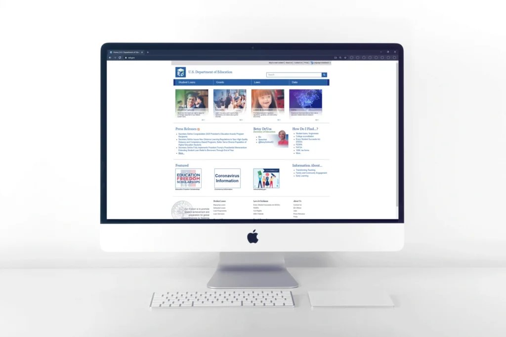
In the peak of the first summer of the 😷 COVID pandemic, our company, IDSI, was looking for more client work when we came across a call to action to redesign the U.S. Department of Education’s website. Our small team of designers took to the task of cataloging the existing sitemap, features and content to modernize the outdated ed.gov. We put together a proposal that ultimately did not go anywhere, probably due to weird budgeting during the pandemic and presidency changeover (the site remains the same as it did back in 2020). However, this project was a very fun and educational (haha wordplay) exercise that contributed to my knowledge of sitemaps, flowcharts and various new-to-me tools such as Coggle.
In the fall of 2019 the U.S. Department of Education hosted an open innovation challenge calling for input from across the country to help shape the design of the new ED.gov. (Read more here.)
Our team began work to provide our expertise, keeping in mind the primary goals of the US DoE:
1️⃣ Accessible
2️⃣ Authoritative
3️⃣ User-centered
The old ed.gov site was in desperate need for accessibility and user-centered updates.
The U.S. DoE wanted to be the end-all, be-all source for U.S. education needs. However, it overlapped and tangled with existing sites, where users would find inconsistent, outdated or irrelevant information.
🤸 User-centered
🤸 User-centered
Update site navigation, make it mobile-friendly and improve search tools to match user needs.
🤖 Modernization
🤖 Modernization
The existing site, built on a lot of older technology that was hard to use and update, could be improved through updating the current and upcoming content using modern methods such as templates, integrations and blogging tools. We could provide an updated roadmap for the site’s and Department’s future.
🌀 Chaotic sitemap
🌀 Chaotic sitemap
During our site audit, we noticed a plethora of dead or duplicate links and pages. We could streamline, simplify and clarify content and information to improve the user experience.
💯 Consistency
💯 Consistency
The site suffered from inconsistencies, with differing visual identity, varied navigation methodology and inaccurate or differing information.
😵 Strained work environment
😵 Strained work environment
Let’s be honest here – working during the pandemic was an extremely strained experience with a lot of pain-points. 🤒
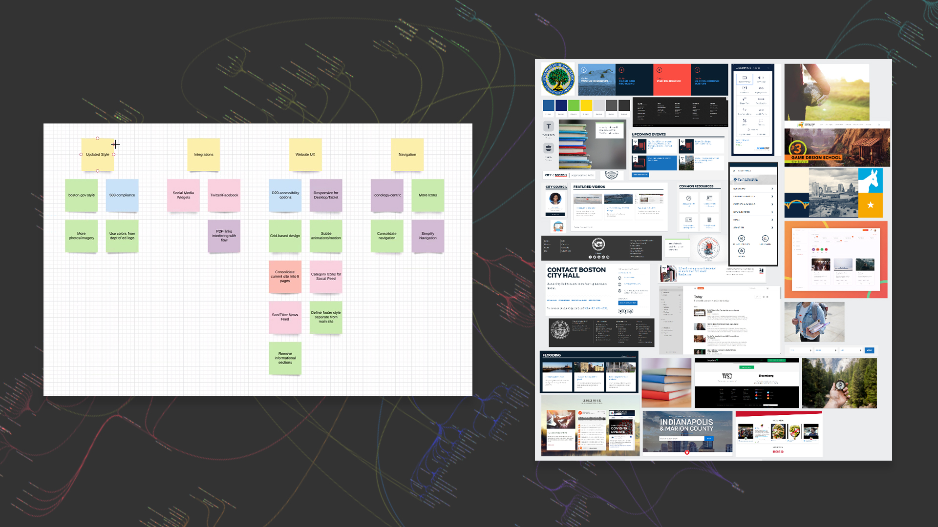
Research
After our initial project Kickoff, the design team and I dove into the research stage, divided into several key disciplines. 🔬
Competitor Research
Honestly, this wasn’t so much “competitor” research as it was “colleague” research. The Department of Education is a federal entity, with several children entities – meaning, individual states. We started our research by looking at the .gov websites of EVERY one of the 50 states (including dialing even further down into some cities or metro areas), comparing and contrasting them, noting: successful sites, and unsuccessful sites. What made Colorado‘s site different from Virginia‘s, and what features and practices made one better than the other? These were all sites dedicated to education on a bureaucratic level, and we could learn a thing or two by comparison. How did each state handle:
Search features?
Contact pages?
Blog posts?
Financial aid documents?
FAQs?
Accessibility Standards and Best Practices
As this is one of the most important goals for the new site, we spent a lot of time making sure we were up-to-date and cognizant of how to design a site that is:
1️⃣ Perceivable
2️⃣ Operable
3️⃣ Understandable
4️⃣ Robust
5️⃣ Conforming
Department of Education "How Might We" and Competitor Research/Moodboard
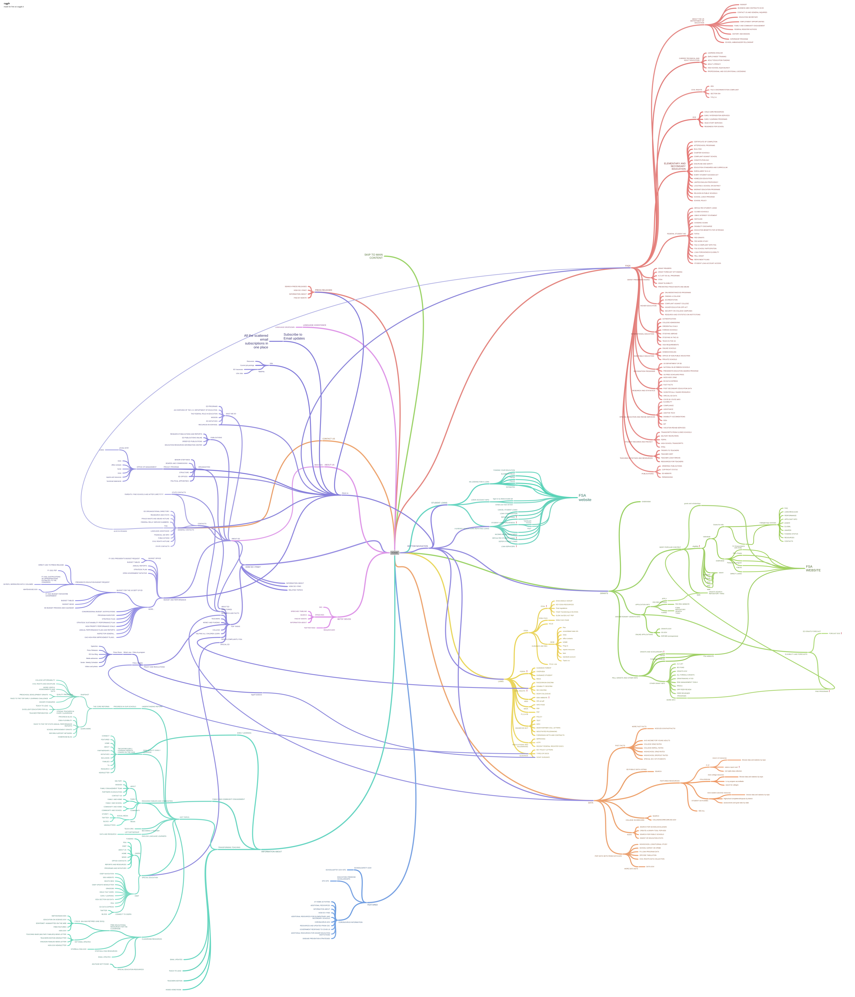
SITE MAPPING
We leveraged the flowchart tool Coggle to map the existing site, which helped us identify site inconsistencies, errors, duplicate or dead links and irrelevancies. This was an invaluable exercise that led us to many opportunities for improving the site navigability.
Modeling our new site using elements from several city and state’s .govs that we found successful, we got to work putting together wireframes.
To streamline the website, we knew we needed some sophisticated blogging tools so citizens could stay informed on education policies during these trying times. (At this point of the pandemic, financial aid and school social distancing policies were on everyone’s minds.) This included operable search features, subscription services, social integrations and tags.
Other vital parts included making sure links to individual state pages were easily accessible, policies could be found reliably, and important financial documents and forms weren’t hidden behind layers of confusing or dead links. Making the footer cohesive and authoritative also became a priority for easy and truthful navigation.
Accessibility features ♿ were also top of mind, with our accessibility features panel prominent in the main nav. We made sure to include text alternatives, and used contrast-checking tools for site perceivability.
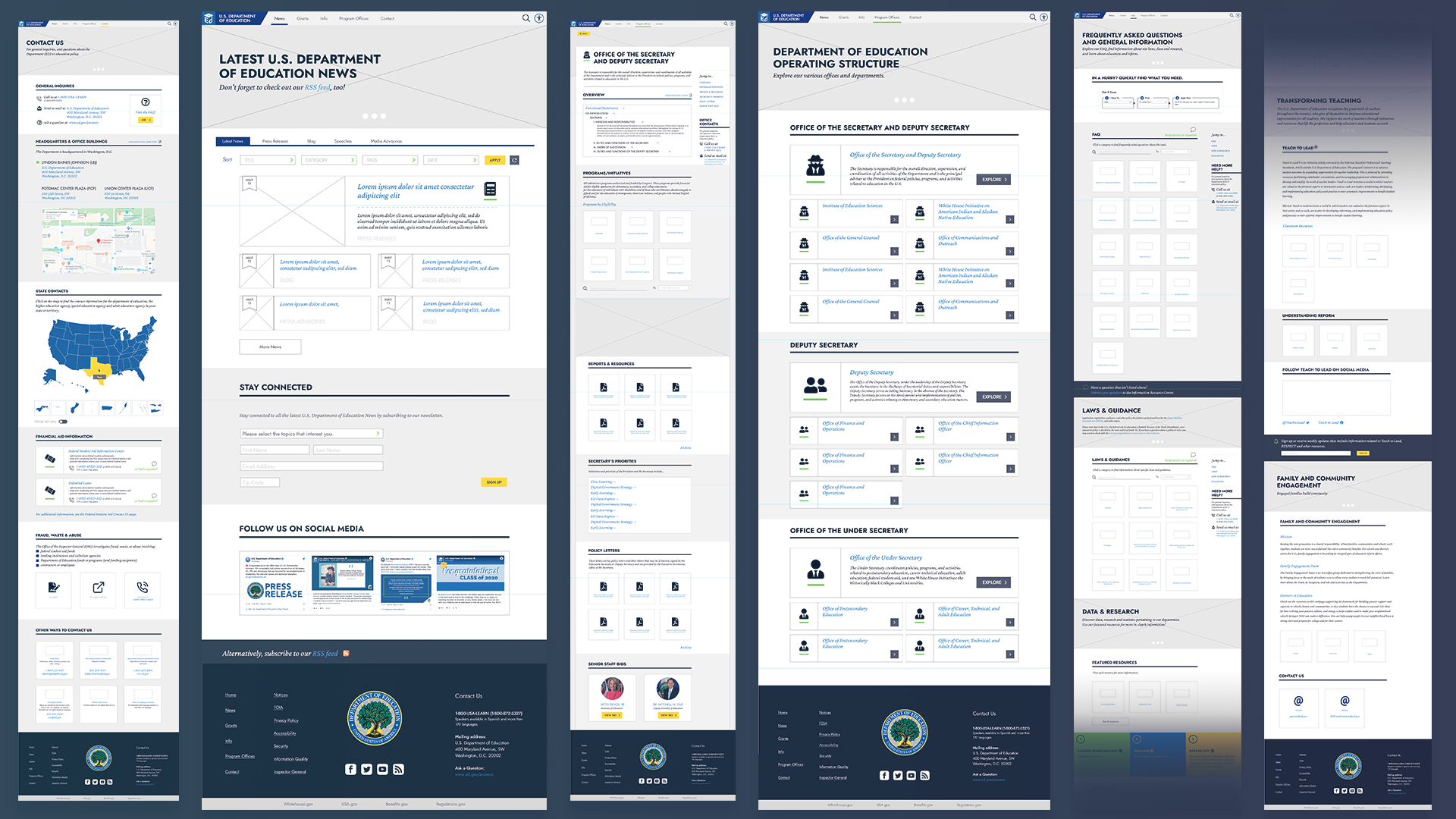
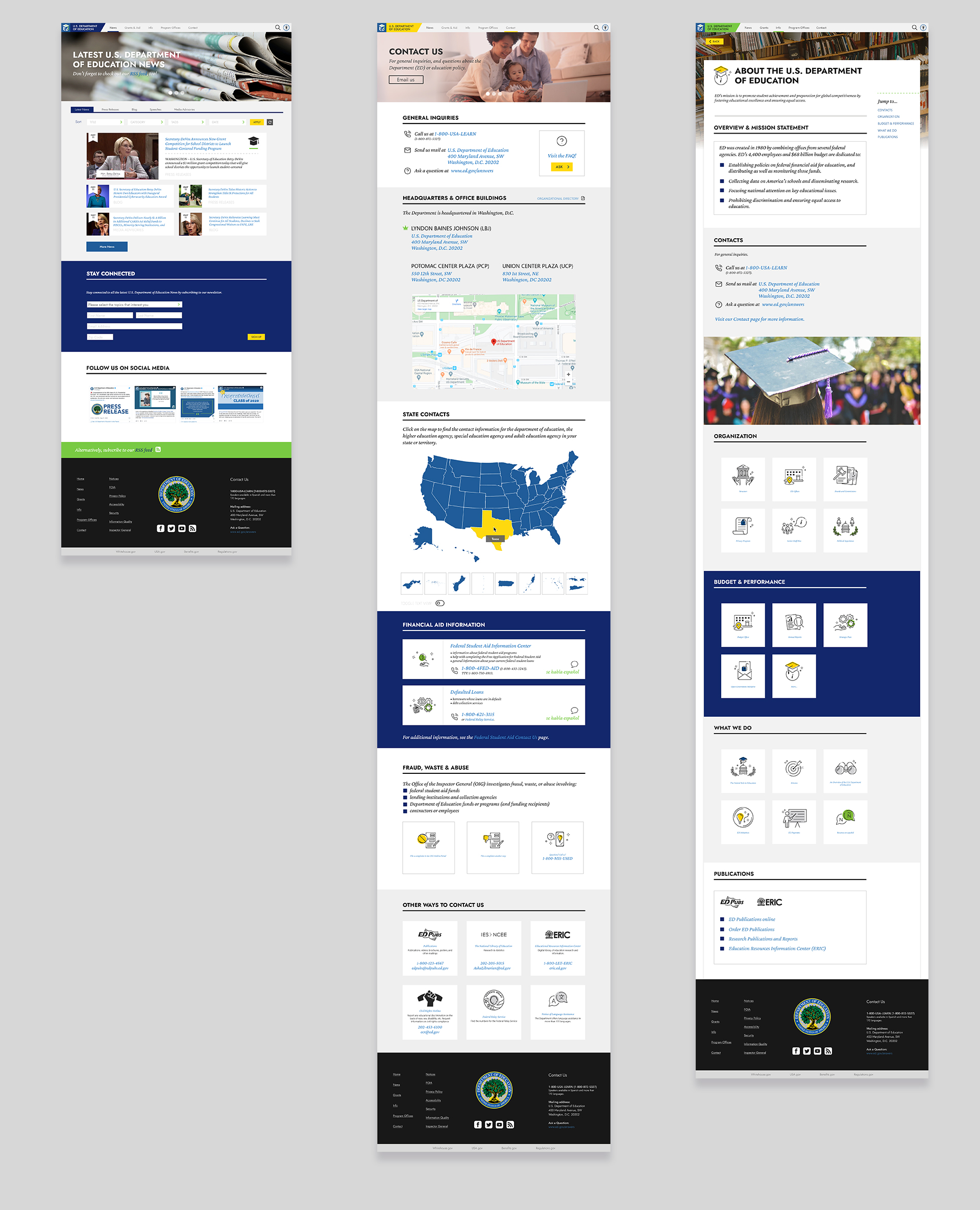
Hi-fidelity wireframes for our proposed site redesign
Mockups & Prototyping
After a few iterations and checks for accessibility, we moved forward with hi-fidelity mockups and prototypes using Adobe XD.
We also created the site’s new visual identity, using their existing colors of blues and greens. Our team collaborated on a new iconography library and chose updated, easy-to-read fonts for the site.
Hi-fidelity final mockups
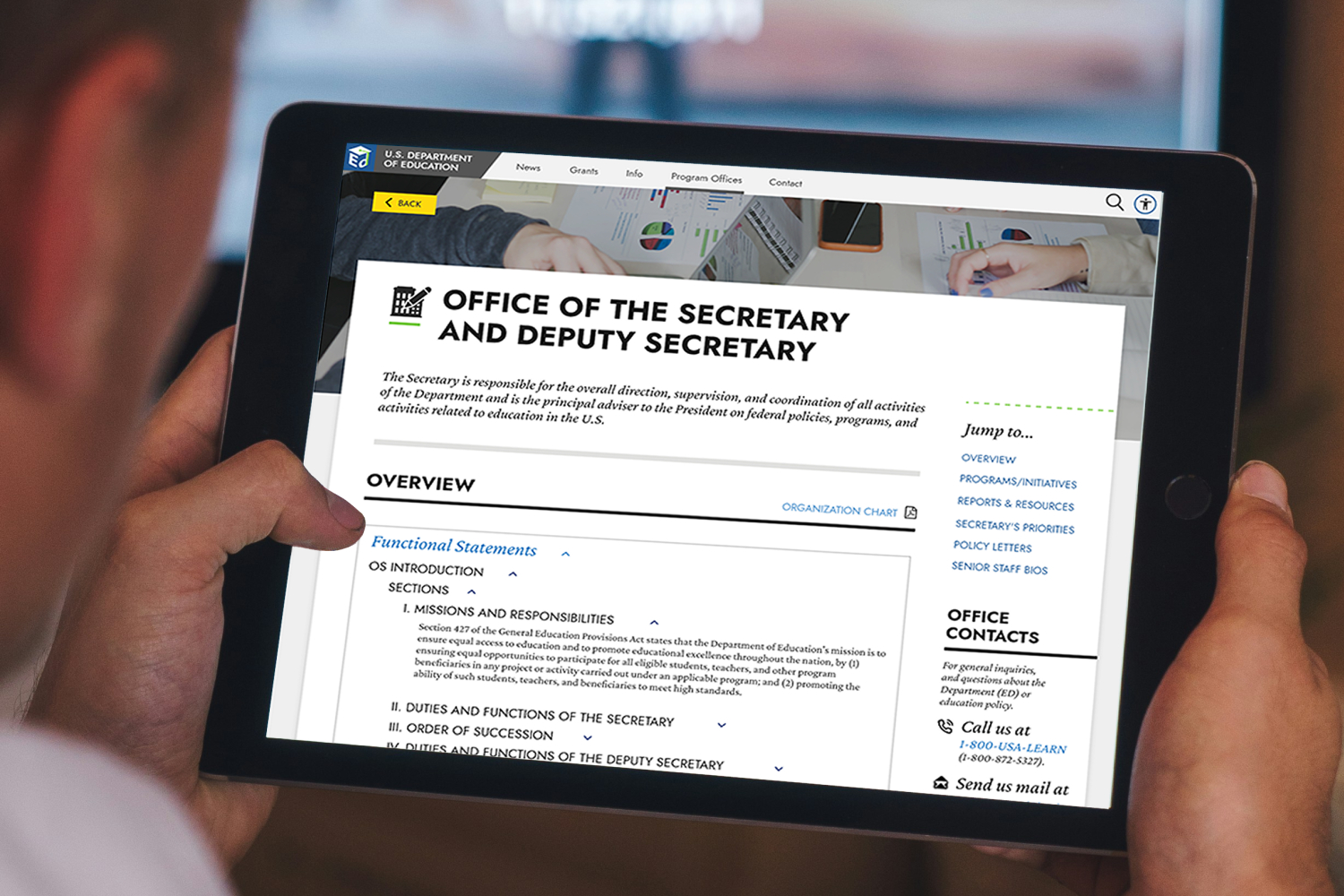
We built our final versions to be responsive and user-friendly for mobile devices.
Outcome
This proposal was a lot of fun to work on, and a real challenge (not just because of the pandemic). It was a great opportunity to learn new UX tools, as well as intimately familiarize myself with site accessibility standards like the WCAG.